How to Use Buttons
The Button widget is used to trigger actions. It can be used individually or as part of a RadioGroup
Required Options
- Images - The button widget requires a ButtonImage object which contains 4 separate NineSlice images
- Idle - Required - Shown when not active
- Hover - Required - Shown when cursor is over the button
- Pressed - Required - Shown when the user clicks the button OR if it a selected member of a RadioGroup
- Disabled - Required if disabled - Shown if the button has been disabled
Common Options
Text - The text shown on the button. This requires the text, a font face, and a ButtonTextColor object. The ButtonTextColor has two colors
- Idle - Required - Used when button is active
- Disabled - Required if disabled - Used when button is disabled
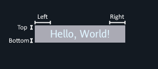
TextPadding - This takes an Insets object to specify the space in pixels to add to the text size of the button.
Event Handlers
- ClickedHandler - A callback that is fired when the button is pressed and released with these args
- PressedHandler - A callback that is fired when the button is pressed with these args
- ReleasedHandler - A callback that is fired when the button is released with these args
- CursorEnteredHandler - A callback that is fired when the cursor enters the button’s bounds with these args
- CursorExitedHandler - A callback that is fired when the cursor exits the botton’s bounds with these args
- StateChangeHandler - A callback that is fired when the button’s state has changed (when button is a part of a radiogroup) with these args
Live Demo
Code
See full example here: https://github.com/ebitenui/ebitenui/blob/master/_examples/widget_demos/button/main.go
	// load images for button
	buttonImage, _ := loadButtonImage()

	// load button text font
	face, _ := loadFont(20)

	// construct a new container that serves as the root of the UI hierarchy
	rootContainer := widget.NewContainer(
		// the container will use a plain color as its background
		widget.ContainerOpts.BackgroundImage(image.NewNineSliceColor(color.RGBA{0x13, 0x1a, 0x22, 0xff})),

		// the container will use an anchor layout to layout its single child widget
		widget.ContainerOpts.Layout(widget.NewAnchorLayout()),
	)

	// construct a button
	button := widget.NewButton(
		// set general widget options
		widget.ButtonOpts.WidgetOpts(
			// instruct the container's anchor layout to center the button both horizontally and vertically
			widget.WidgetOpts.LayoutData(widget.AnchorLayoutData{
				HorizontalPosition: widget.AnchorLayoutPositionCenter,
				VerticalPosition:   widget.AnchorLayoutPositionCenter,
			}),
		),

		// specify the images to use
		widget.ButtonOpts.Image(buttonImage),

		// specify the button's text, the font face, and the color
		widget.ButtonOpts.Text("Hello, World!", face, &widget.ButtonTextColor{
			Idle: color.RGBA{0xdf, 0xf4, 0xff, 0xff},
		}),

		// specify that the button's text needs some padding for correct display
		widget.ButtonOpts.TextPadding(widget.Insets{
			Left:   30,
			Right:  30,
			Top:    5,
			Bottom: 5,
		}),

		// add a handler that reacts to clicking the button
		widget.ButtonOpts.ClickedHandler(func(args *widget.ButtonClickedEventArgs) {
			println("button clicked")
		}),
	)

	// add the button as a child of the container
	rootContainer.AddChild(button)

....


func loadButtonImage() (*widget.ButtonImage, error) {
	idle := image.NewNineSliceColor(color.RGBA{R: 170, G: 170, B: 180, A: 255})

	hover := image.NewNineSliceColor(color.RGBA{R: 130, G: 130, B: 150, A: 255})

	pressed := image.NewNineSliceColor(color.RGBA{R: 100, G: 100, B: 120, A: 255})

	return &widget.ButtonImage{
		Idle:    idle,
		Hover:   hover,
		Pressed: pressed,
	}, nil
}

func loadFont(size float64) (text.Face, error) {
	s, err := text.NewGoTextFaceSource(bytes.NewReader(goregular.TTF))
	if err != nil {
		return nil, err
	}

	return &text.GoTextFace{
		Source: s,
		Size:   size,
	}, nil
}